pedro.de.portugal's work as a graphic designer is based on creating striking visual identities and designing editorial materials that communicate with clarity and impact. Through the strategic use of color, typography, and composition, I develop graphic solutions that balance aesthetics and functionality. The creative process prioritizes visual harmony and communication coherence, ensuring that each project conveys its message effectively and engagingly.
O trabalho de pedro.de.portugal como designer gráfico assenta na criação de identidades visuais marcantes e na concepção de materiais editoriais que comunicam com clareza e impacto. Através do uso estratégico da cor, da tipografia e da composição, desenvolvo soluções gráficas que equilibram estética e funcionalidade. O processo criativo privilegia a harmonia visual e a coerência comunicacional, garantindo que cada projecto transmite a sua mensagem de forma eficaz e envolvente
With a fantastic photo of Peter Thomas, and with the use of Abolition Font, Photoshop, this is a poster for a Chinese Cousine Festival in Lisbon.

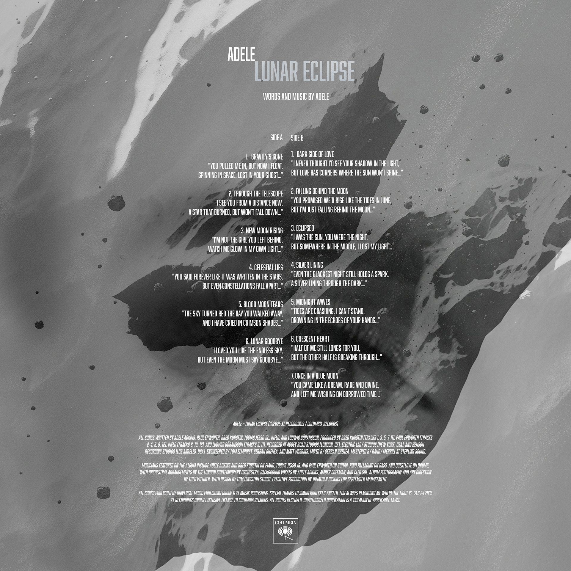
An exercise on LP album covers. ADELE LP "Lunar Eclipse". Photoshop with a beautiful photo from RSDB™ is a Production Asset Library of Resources and Development Tools for Makers, Designers, & Artists. Made by → (Maison) ALLE™ @maison.alle and using Abolition regular and oblique font.

The Witchfinder #30days30posters

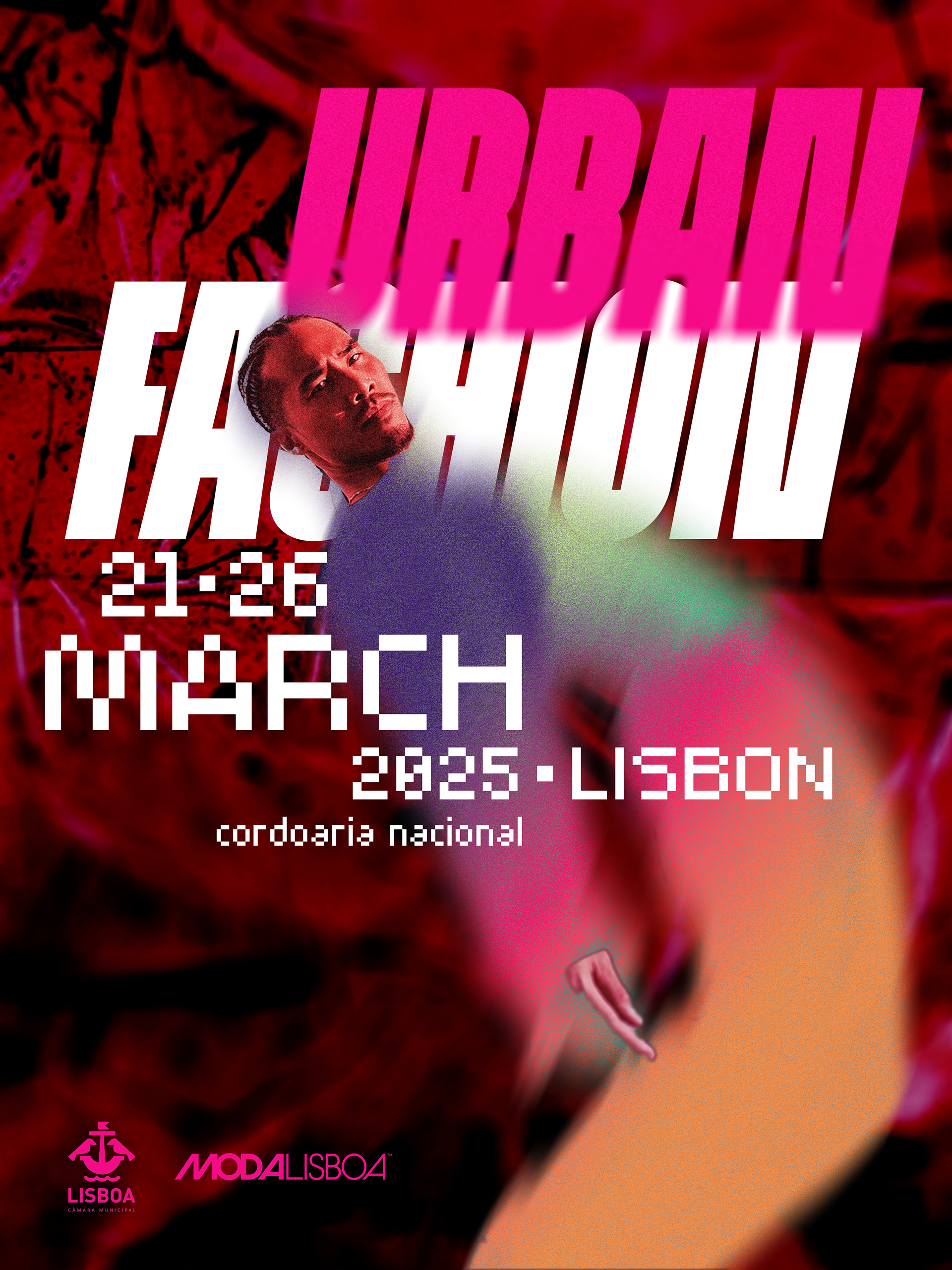
URBAN FASHION #30days30posters
Model Photo from Karsten Winegeart and background from Eugene Golovesov. Type ROUND8 from Atipo Foundry, and Pixer from Fontfabric
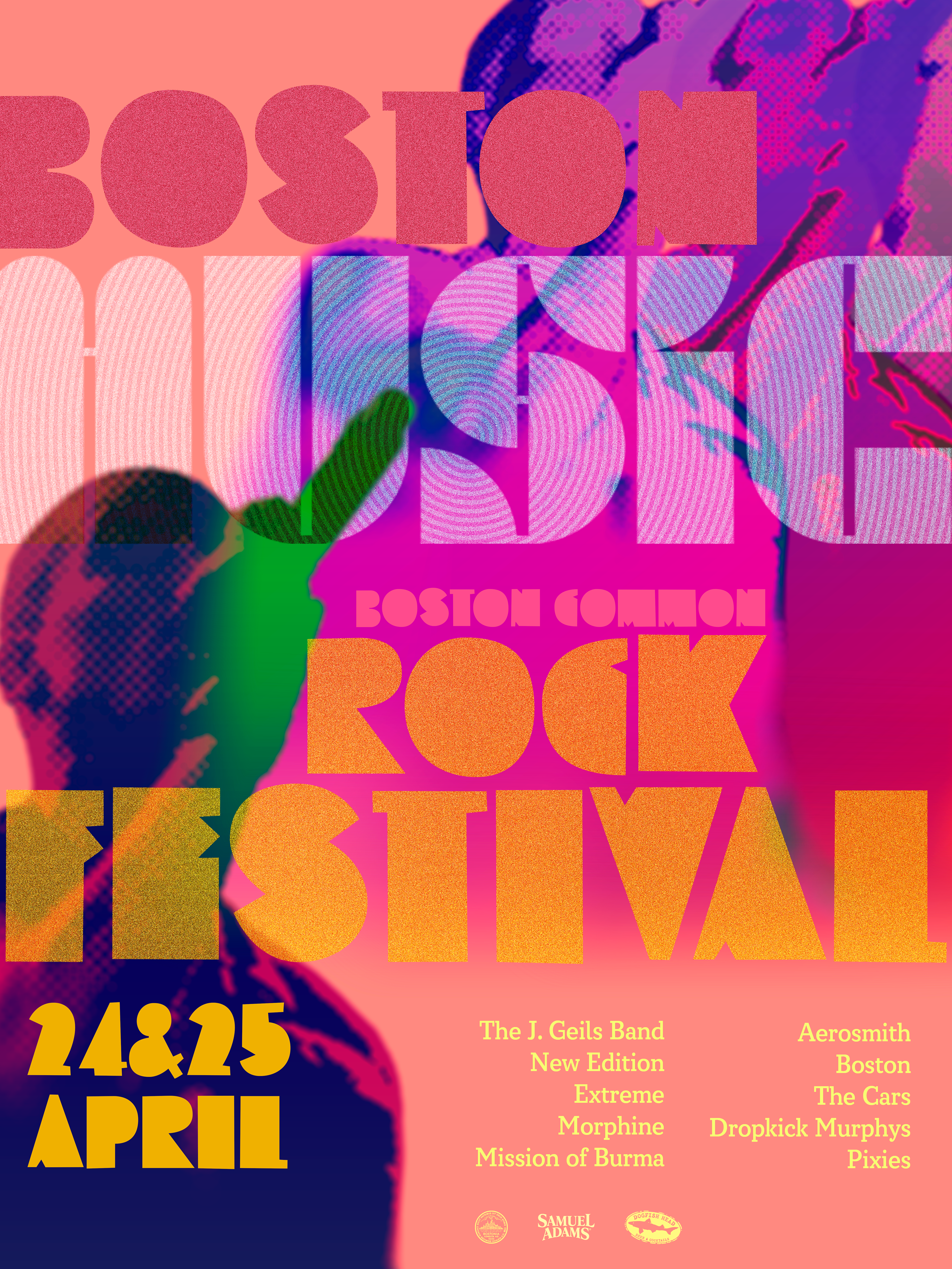
BOSTON MUSIC FESTIVAL #30days30posters
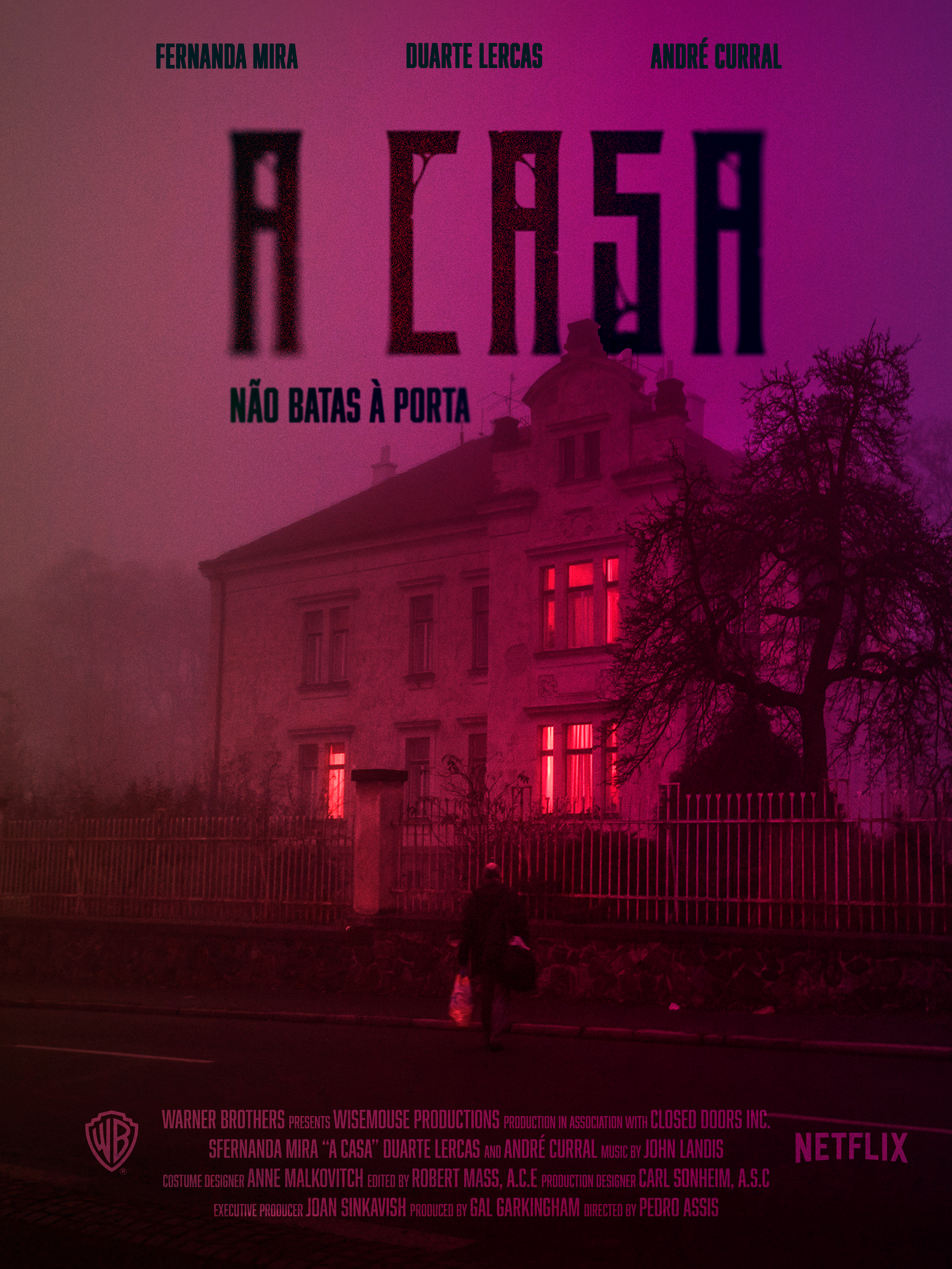
A CASA #30days30posters
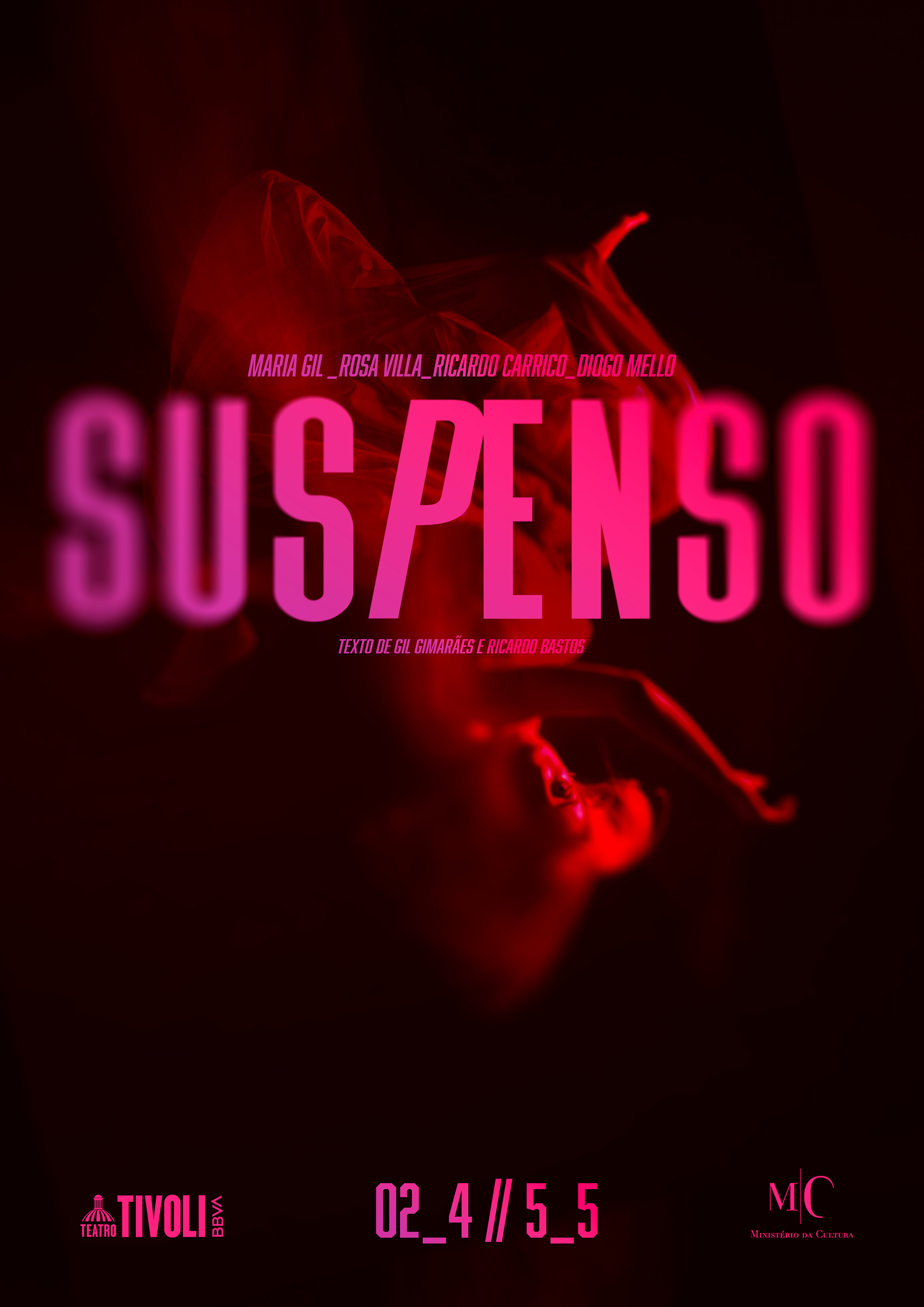
Suspenso #30days30posters
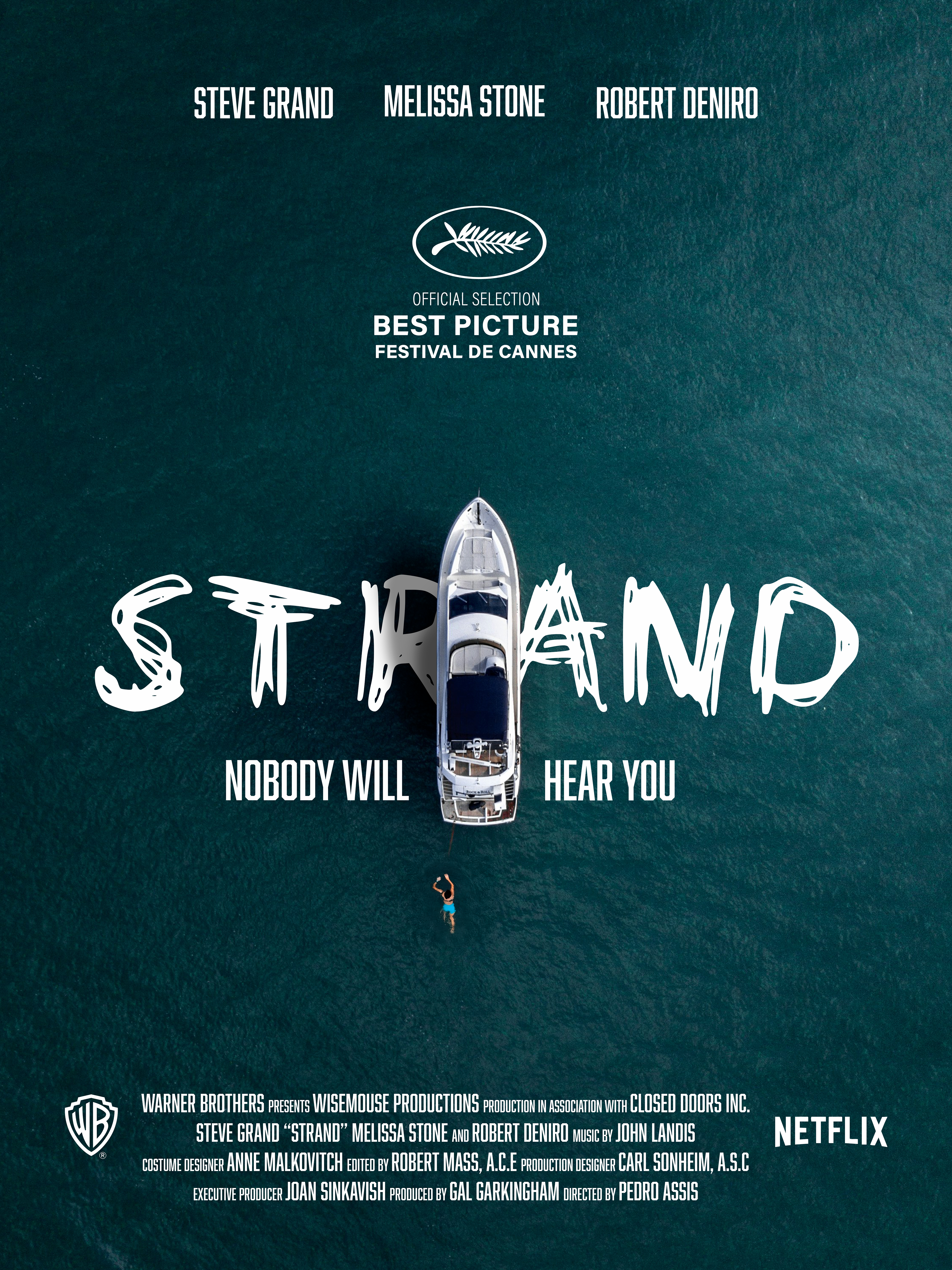
Strand #30days30posters
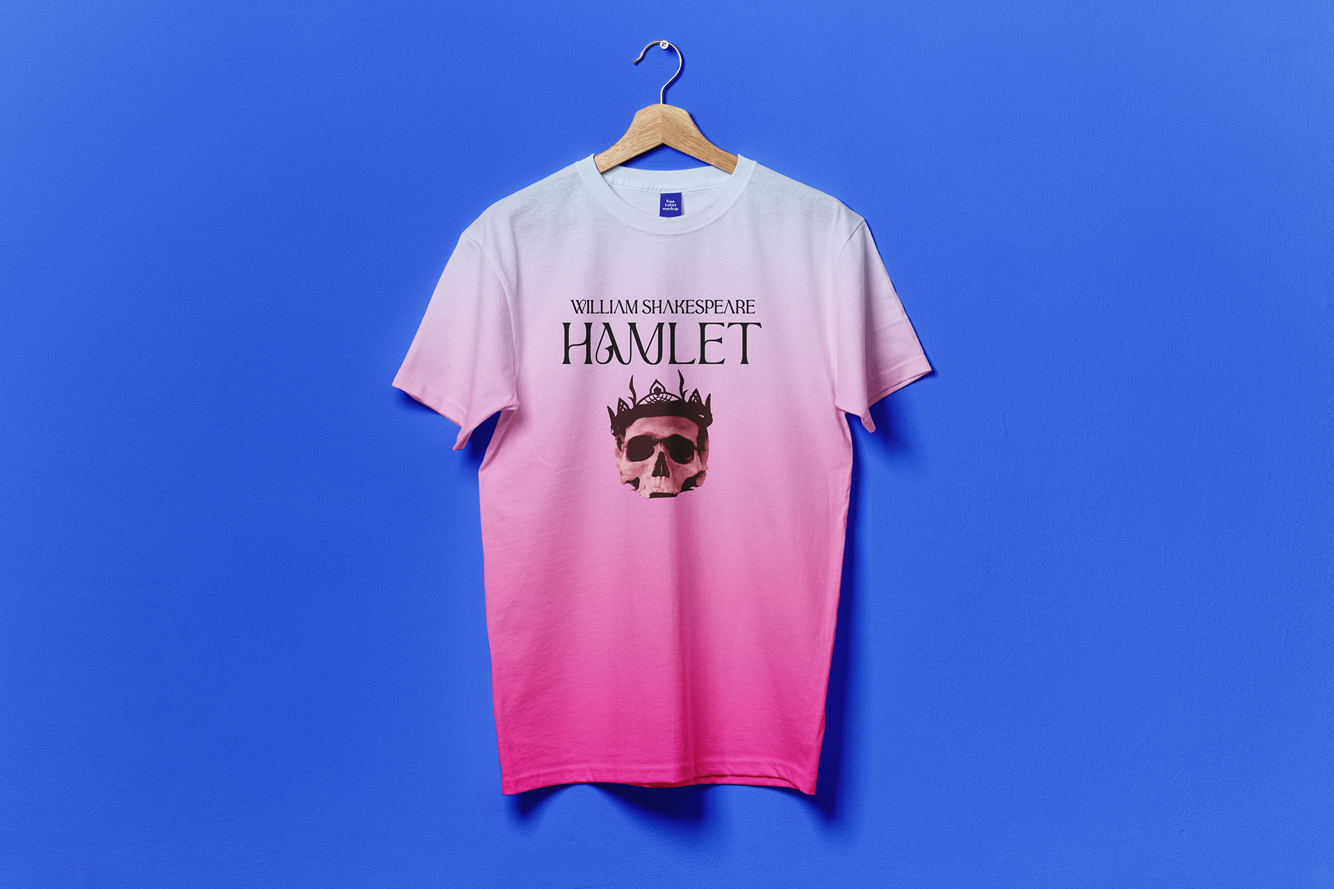
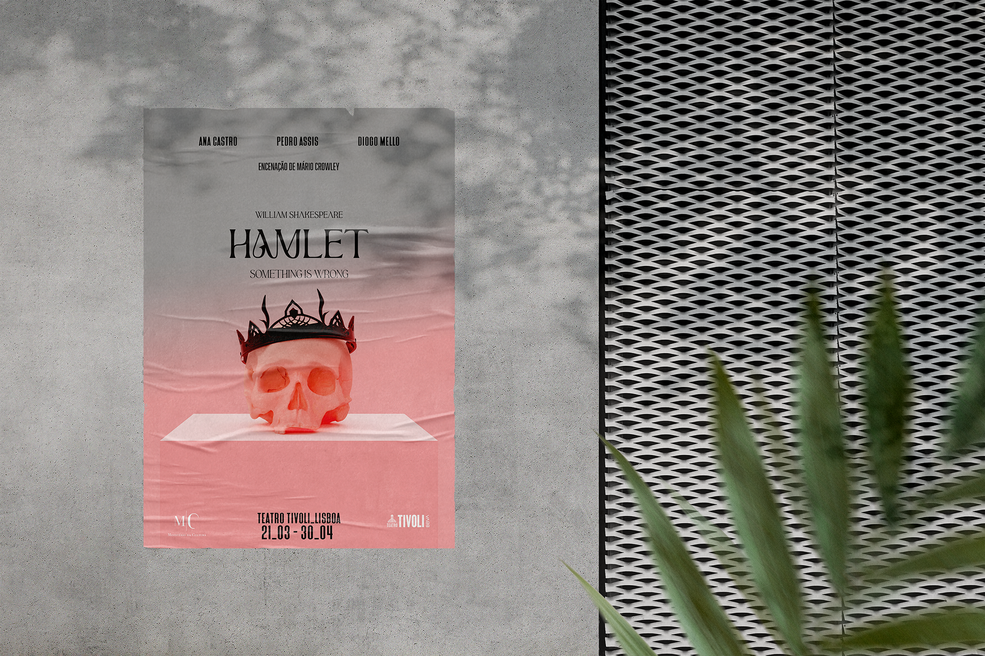
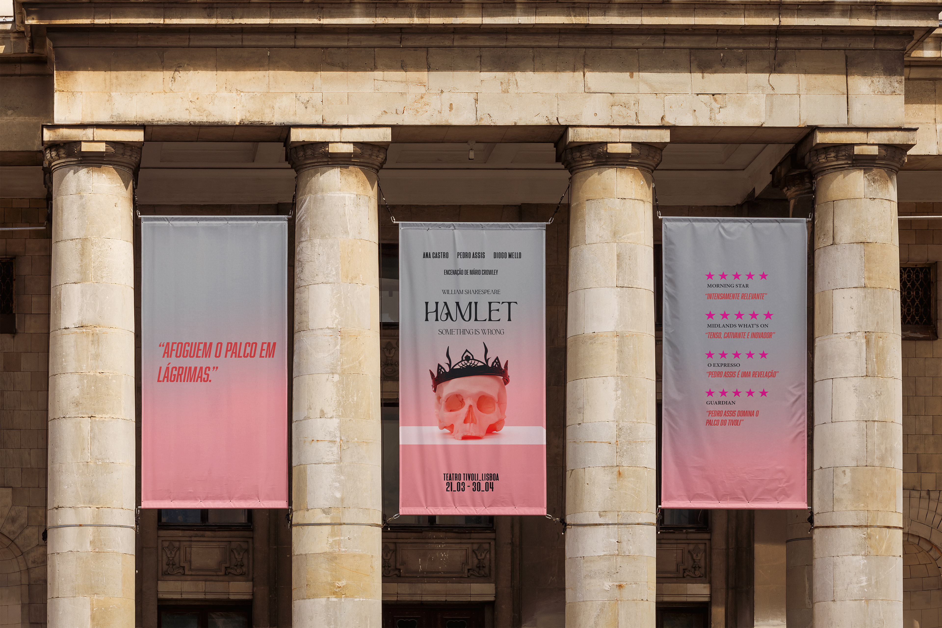
Hamlet

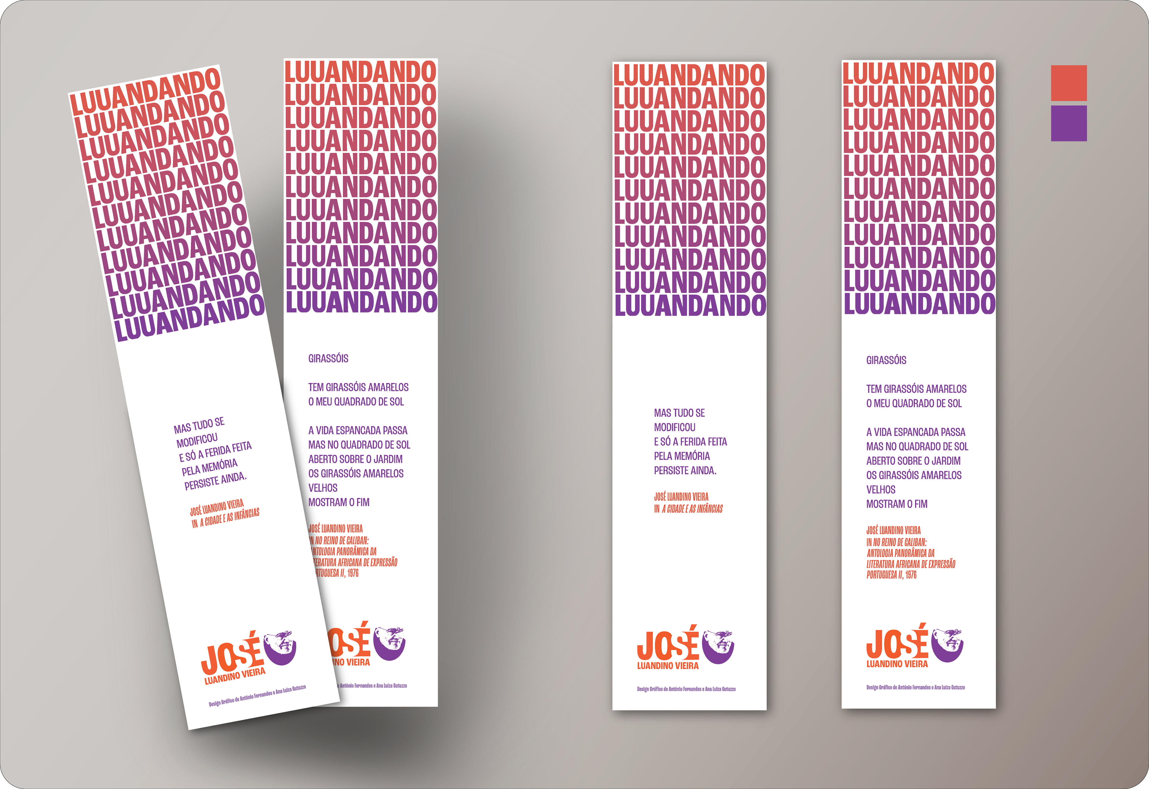
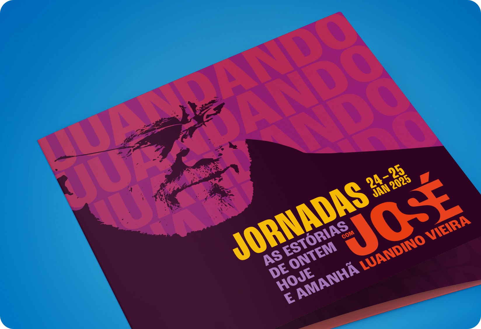
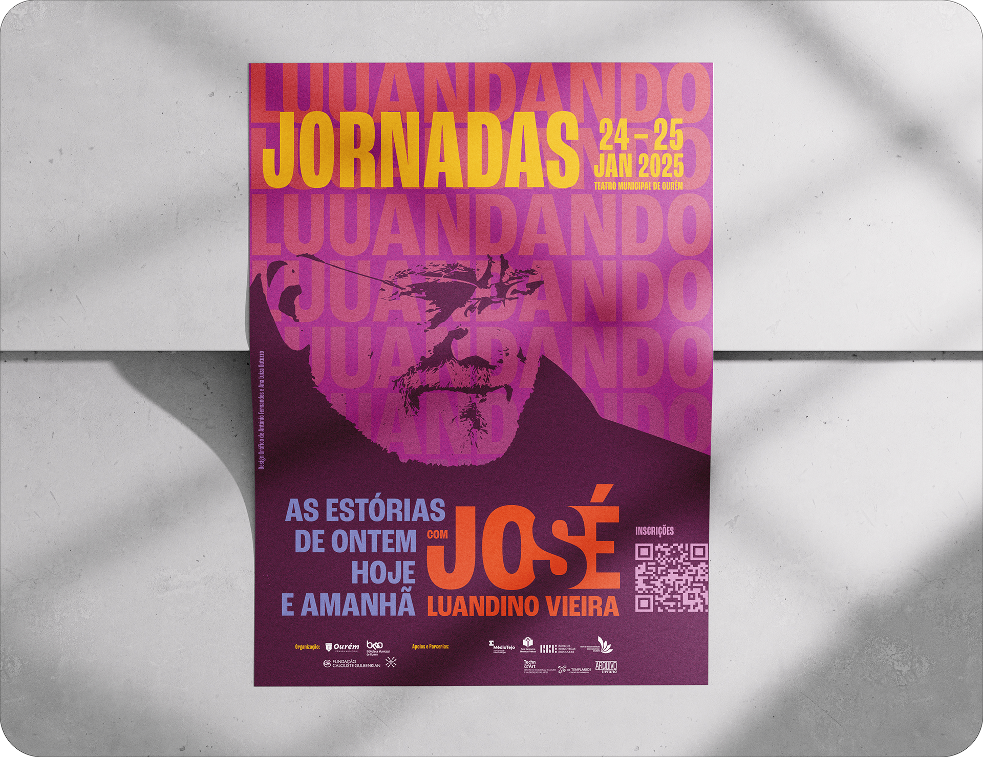
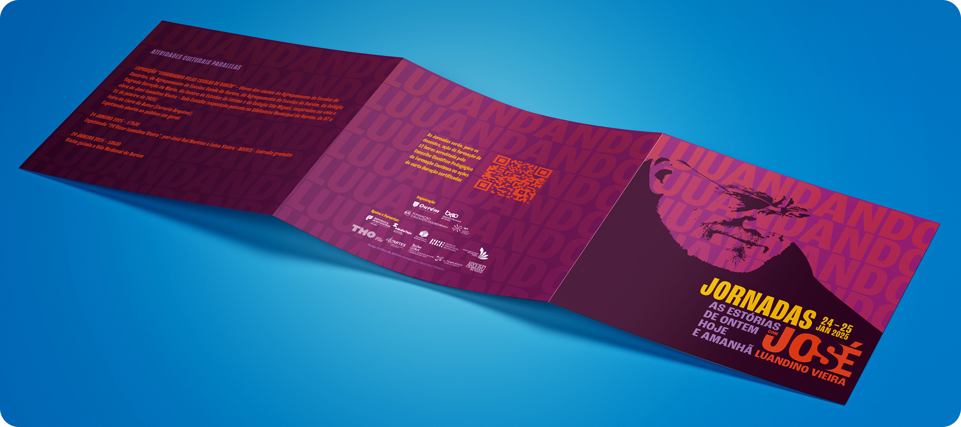
jor.nadas luuandando